Thursday 21 May 2015

Covered: Edited Conversations - Confucius

The book is called Analects which translates to "Edited Conversations". I thought this would be an interesting title to work with because I could directly apply it to the book cover by editing and manipulating the words.

編輯對話 = Edited Conversations


This is the process I took when creating my book cover. As it was work for an exhibition I wanted it to grab attention straight away which is why I have chosen to keep the image central on a white background using bold colours. I had created a variety of colour combinations for the type and felt that this was the most appropriate. 

To show the blend between languages I mirrored the English heading with the Chinese version which creates and effective contrast between the two and gives the title and overall design more of a context. 

The back cover is a small blurb roughly outlining some of Confucius' ideologies and a quote to accompany it.    


Another subtle effect to make the print look more organic was to add a displacement map which randomly distorts the image by breaking up some of the pixels. 

I feel as though I have achieved what I proposed for this project and found I could't expand on the design much further. The cover works as an original rather then a re-design as the original was just a collection of scriptures. I have brought a book 1000s of years old and appropriated it into a contemporary setting.          

Exhibition piece:

Printed on snowden cartridge 300gsm 


Tuesday 19 May 2015

Hands Up, Don't Shoot - Website

A strong design aesthetic has already been established so was simple to transfer to a web format.

News Feed 

The pages are fairly self explanatory: the home url will open up to the 'News Feed' which will have a list of news reports as they happen and will be constantly updated with a time and date stamp to order them. The user will be able to scroll 4 stories on a page then navigate to older posts though a page number link. Spreading out the content to multiple pages will cut down the pages loading time as there is less information and will make it easier to the user to manage what they are browsing.


In terms of design, it layout is straight forward as the content take priority and would't want overly decorative features to obstruct important information. 


When hovering over a link the text will invert making it clear that it is selected and will remain when on the page. 


This will be the same when hovering over a story. 


Once a link to the story is clicked this is how it will appear on the page with other article links at the side of the page. 


Location

For the location page the navigation will act the same way but when hovered over will change to the most recent incidents coordinations through as gif. image.  


The locations page page will open up a map with the locations of any of the stories across the globe. I decided to add this section as it links the coordinates in my zine and I felt that it was too focused on America despite it being and global issue so wanted to show that. It also could extend the project to creating quarterly zines about different countries where it is a problem. 


When a point on the map is clicked text will show with links to articles related to that area.  

The Zine


To promote my zine further I have added a page where a copy can be requested and then posted. The zine will be free as it is a non-profitalble cause however I will ask for the cost of postage and a small donation of their choice. 

I would like to continue this project beyond the module as it is a cause I feel strongly about and is an ongoing problem. It was also enjoyable creating the zine and will be good to start a series of issues. 


Friday 15 May 2015

Hands Up, Don't Shoot - Zine

Final publication for a collection of police brutality cases in America. Overall I am pleased with the outcome and how it has printed, despite some issues in page alignment which were due to the printer and beyond my control. The zine has achieved my initial goal which was to collect incidents of police brutality and show the severity and in some cases the injustice for the victims. I have also linked it to prior incidents to show how little attitudes have changed over decades which could still be down to a form of institutionalised racism.


An extension to this project (as police brutality is an ongoing issue) would be to create a website which can constantly be updated with articles and images as they happen. Extending it to a website will allow for more broad reportage from around the globe and through comments sections and a public forum on the website would provide a platform for discussion.  


Thursday 30 April 2015

Disobedient Objects North

Experimenting with various layouts and fonts for the Disobedient Objects Exhibition.

As the flyer would be printed the document was set up in CMYK with a 3mm bleed and exported at a resolution of 300dpi. The white/black circle is a placeholder for the People's History Museum which is the same shape as I couldn't find a vertorised version.


Final Version

This version stood out the most to me. The previous versions seemed too structured considering the subject, whereas this one is a bit more sporadic yet fits within the grid. Contextually the cut-out effect on the type and the grainy image is reference to the punk rock movement in which Disobedient Objects were often used. 


Methodology

The direction I take at the start of most projects is to relate it to something I find interesting outside of Graphic Design but allow graphic elements to be incorporated. I enjoyed the freedom we had with the responsive briefs and got really involved with a few of them. I find I can get along well independently which made the module easier as it was very self directed, but also wont hesitate to ask for others help or opinions when stuck. My method always stems from my initial research which then leads to an idea on what to create and the medium that will be most appropriate.

The feedback I got from the 503 module suggests that this is the case and comments were generally about my good use of contextual referencing and research which informed my design decisions. An improvement in need to work on is my time management. I tend to spent too much time on one part of a brief (research/designing) and not give myself enough time to produce a final polished outcome.    

Friday 24 April 2015

Police Brutality Zine: 'Hands Up, Don't Shoot'

Common phrase used by protesters. 


Front Cover Experiments 

The content will be matter-of-fact because I am adding type from a number of different sources throughout the zine and saying it how it is, the black and white colour choice will reflect this transparency. It also relates to more obviously police colours in America (black and white cars) and the unbiased two sides of the stories - those responsible vs those affected - giving people the opportunity to form their own opinions while reading through.  


I am currently not sure on how I will print the cover but do plan to use a different black stock to the rest of the zine so will have to see how this will limit what I can print onto it.  


I have decided to use the image below as the front cover which I will screen print using a clear varnish on black stock. This will result in the text being hard to notice at first and will require someone to interact with the publication to discover it.   


The typeface is similar to one that can be found as the time and date stamps on CCTV footage which have recorded many of the incidents. I want to present the type and images in a slightly distorted manner as a lot of the videos fail to capture the full incidents, are a low quality/grainy or are from an odd angle making it hard for others to interpret what actually happened. In contrast to the synthetic sans-serif typeface for the title I have chosen to use a serif typeface to further emphasise to two different point of views.   

Content

Quotes, opinions, facts and statistics gathered from my research. Will add as high impact typographic pieces alongside images.  


I have established a grid system I can begin adding my content to. The challenge will be to keep a certain structure that fits within the grid and keeps the pages consistent, yet provide variety to keep the reader engaged.  


Thursday 23 April 2015

OUGD505 - Studio Brief 2 - 'Covered'

Undertake research to uncover a notable ‘thinker’ – a theorist or philosopher – whose concepts or views resonate with you.

Chosen book: 

Analects - Confucious 

The Analects (Chinese: 論語; pinyin: Lúnyǔ; literally: "Edited Conversations"), also known as the Analects of Confucius, is a collection of sayings and ideas attributed to the Chinese philosopher Confucius and his contemporaries. (Wikipedia)

I have chosen this book as ancient Chinese history is something that has always interested me because it is so culturally unique in all aspects. The music, art, writing, clothing, mythology are all incredibly distinctive and I would like to show this in my design. Another reason is that the original book is so old (475 BC–221 BC) its cover is unknown, or wether or not it had one, so instead of a re-design I will be creating something new. 


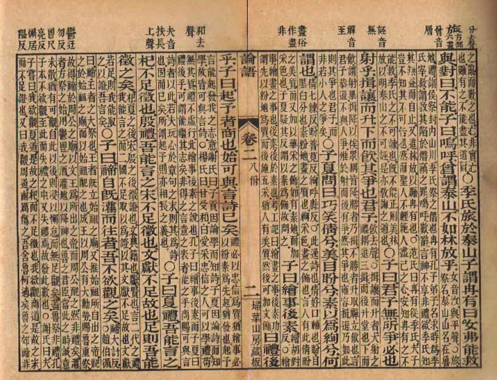
(image from original book)

Chinese calligraphy looks incredibly intricate and detailed which I want to try and incorporate into my design.