As the start of our project we were give a word and a font at random which we had to combine to create a sequence/series of ten of our own letterforms using the word and my font 'Futura' as the base of the letters. The word I have been given is 'Speech' and I have to create the letterforms in a 10 x 10 format which relates to or represents this word.
I started to map out anything I could think of relating to the word and how I could incorporate my font (futura).
Futura + Speech - I thought about how the two words would work together in a literal way. Futura made me think of future/futuristic such as binary code, digital, modern language/slang and a more traditional perspective such as scripts, motivational speeches, quotes and different languages.
Alternative words:
Voice
Sound
Mouth
Deaf
Communication
Talking
Singing
Stutter
Language
Type Basics
We started to look at the anatomy of type and how making various adjustments to the letter can change the nature and meaning. For example adding serifs to the typeface could change a non-formal and legible letter or word into a more formal decorated typeface which would communicate something different. Changing individual sections of the type face such as the ascender and x height on the letters can give it different properties.

I have come up with some initial ideas on how I can show elements of speech through my letters, trying to include variation in how I have manipulated the letters by making obvious changes and some more subtle.
Sound waves was one of my first responses and feel it is too obvious. I don't really like how I have represented it either as the lines make the body of the letter too cluttered.
Structure - I chose this as a definition of speech is a combination of vowels and consonants structured by syntax's. The boxes show organisation and a structure to the letter.
I decided to break up the letterform as I imagine stuttering to have similar qualities to this is if was shown physically as it its disrupted speech and can sound quite harsh, hence the sudden cuts and sharp corners.
Looked at ways I could make futura more traditional by adding serifs and experimenting with a script version as I was exploring old play scripts and speeches. Although Im not sure if this is a direction I want to take it as I am more interested in producing a more contemporary typeface for this particular project.

For a lot of my research I was looking at what generated speech and how it was recorded I picked out words which had elements I could display physically in the letter forms each with certain qualities.
Communication/Language
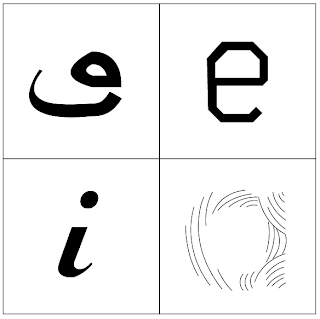
While researching into language and communication I came across the term 'Sprachbund' which is a term used to describe the combination of two languages. Although it only technically happens when two countries speak different languages that are in close proximity to one another, I thought it would be interesting to combine English letters based on the latin alphabet with a completely different language (arabic).
I wanted to show the crossover idea by having a letter from the arabic alphabet merge into an english letter. I have split both of the letters (in this case arabic O and E and english O and E). I tried to not make the letters too abstract and used futura as the base typeface. Using recognisable features of each letter, for example keeping the eye of the E makes the type still legible.
To keep within the brief I started to transform the script arabic writing into a more geometric san-serif typeface like futura. I compared elements of the arabic letterform to the english futura font I was using and made changes accordingly such as keeping the line weight even throughout on the shoulders and tails, removing any serifs and using angles and even measurements.
Above is a project I found on Typothegue by designer Bahman Eslami which relates closely to my project as they have incorporated Naskh, the calligraphic style from which most Arabic/Persian typefaces are derived and adjusted it to work with the font Lava. The arabic letters have been simplified and have taken elements of the Lava font. I hope to take this a step further and merge the word written in both languages on one either by half and half or a more gradual transition.
Here is a concept if I was to extend on the brief. Using the word communicate in Arabic and English and combining the two. This could be used for a language guide for people trying to learn either language in a visual way.


