Friday 28 February 2014

Communication is a Virus: Presentation (2 Ideas)


To start of as a group we mind mapped some ideas relating to our given subject charity. A lot of our ideas were topical at the time, we felt it was important to focus on something that people were already aware about in order to reach the most amount of people. 


During the winter olympics Russia was scrutinised by media over its attitude to homosexuality. A lot of people were previously unaware of how harsh their laws are creating a lot of controversy. Our idea was not to set up a charity but help back other big organisations. 


Wednesday 19 February 2014

OUGD404 Conceptual Type

'To begin with, let’s be clear that conceptual type is an oxymoron. A typeface can’t really be conceptual, because it is dependent on its execution. Typeface design is a craft, so the process that transforms the pure idea into a functional font is a critical part of the discipline. Before the typeface is executed, it is not a typeface, it is simply an idea.' - Peter Bil'ak 
 
A type design project that approached the definition of conceptual art was FUSE, launched by Neville Brody and Jon Wozencroft in the early 1990’s. FUSE consisted of a set of four original typefaces with corresponding posters, and an accompanying essay. Each issue had a theme such as religion, exuberance, (dis)information, virtual reality, etc., but the designers had complete freedom as to how they interpreted that theme.


https://www.typotheque.com/articles/conceptual_type


Friday 14 February 2014

Secret 7" Final Crit and Submission

I got a good response from my crit group today after explaining the concept behind my designs. It was interesting to see how everyone had interpreted their songs and there was a massive variety in the work produced.


I added the 7 lines which links the design to the band as well as the song. It could also relate to the fact that it is a 7" vinyl that hadn't occurred to me until someone during the crit pointed it out.  


Friday 7 February 2014

Secret 7" Crit Feedback


Key points from the crit:

- Keep minimal colours/graphics 
- Black represents the band the best
- Seven moons idea is strong. Maybe combine some of the ideas.
- Eclipse with white lines is the strongest 

I found this feedback fairly helpful in deciding which idea to carry forward. The eclipse idea seemed to be the most popular and it was recommended that I use the 7 coloured lines to link to a Sabbath. I want to submit more than one design to the competition so would like to continue to develop the other designs. 

Thursday 6 February 2014

Secret 7" Alternative Designs

I looked at how I could show my designs as simply as possible, taking inspiration from my research into album covers. My concept behind the artwork I felt was quite strong already so I wanted to explore ways of interpreting the themes of the artist and songs.


Some feedback I got from asking people before the crit was that they liked the simplicity and the clean vector images were effective. However for the designs above in particular needed more added to them as they were too simple. 


I came up with this image after experimenting in illustrator. The lines have created a sort of illusion as the get closer together in the centre making it look as there is light being emitted from behind the circle like an eclipse. The song is dramatic, dark and mysterious and I feel this design relates to that quite well. In the crit I will ask if there is anything that could be added/improved to the design to make it more effective. 

Secret 7" Age of Reason - Black Sabbath [Initial Designs]

I wanted my design to be fairly minimal as I thought these looked the best as album covers. The person viewing it might be intrigued into what song the cover is representing and it also links to my theme of mystery and unknown. 

I was randomly inspired to create a 3D sphere for my design while playing pool. I thought the 8 ball looked like a planet on the blue table so I decided to photograph it close up.   


I created the sphere by adding a couple of layers of gradients and shadows to get a 3D effect and some grain for an extra layer of texture. I wasn't initially sure of what colours to use - the back ground needed to be dark as it was a planet in space. I wanted the colours to stand out and found that the pink created the most contrast and was eye catching and different. I will ask as one of my questions in the upcoming crit if the colours are appropriate and hopefully will gain some suggestions.     


I ran into a problem when test printing the design as I had produced it in RGB so some of the more vibrant and saturated colours had been dampened down because of the printers limitations. 

CMYK Mode:


I managed to adjust some of the colours when in CMYK mode on photoshop until I got the colours I was happy with and would print correctly. 


Printed version:


Alternative compositions


For the crit coming up I want to print a variety of these layouts to show as I am not sure what communicates my concept the most effectively and what design people prefer in general. 


Wednesday 5 February 2014

OUGD404 Hierarchies (Websites)

HUH

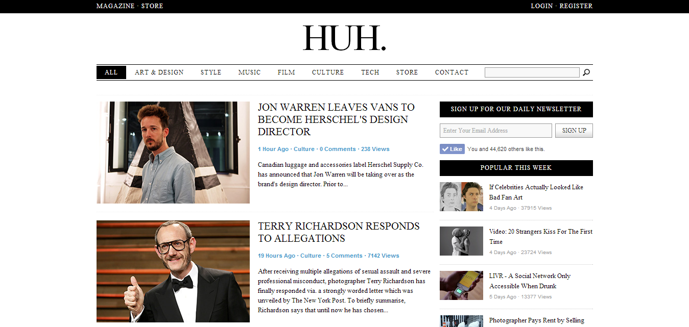
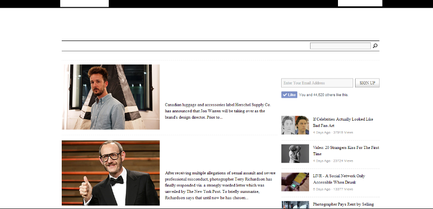
The hierarchy of type on this website was effective in communicating what order of information the editors wanted you to focus on.  
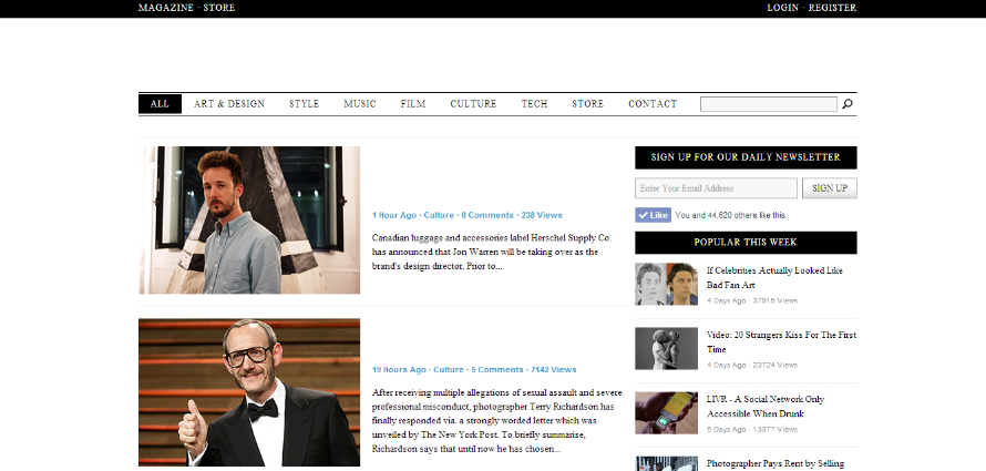


The first thing was the title of the site 'HUH' placed at the top centre of the page in the largest point size - this will help enforce the brand and make it clear what site you are using.


Next thing that stood out on the page was the news stories in the second largest font and leading directly down from the main header. 


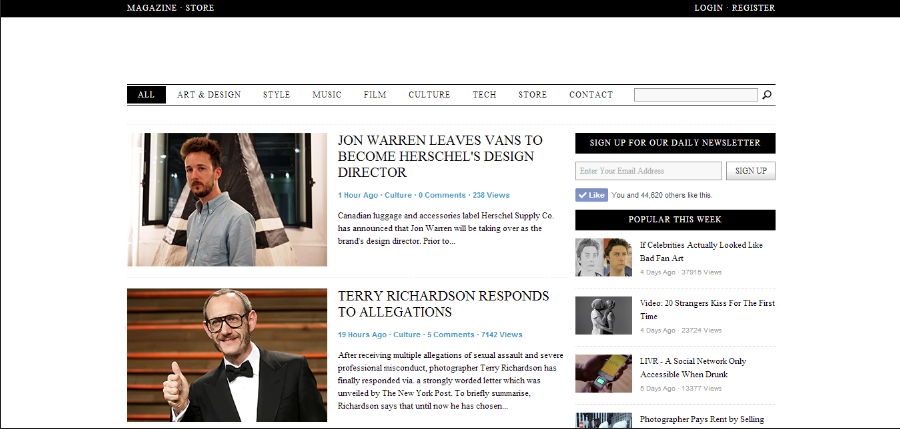
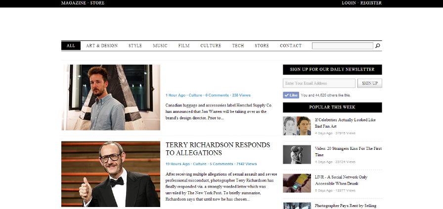
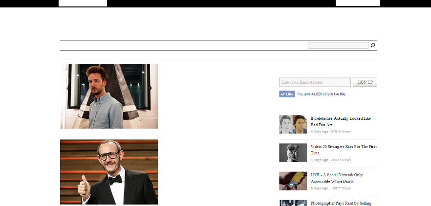
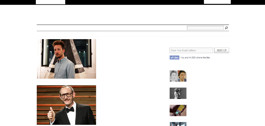
Looking at the page in a smaller format on this blog post makes the text in the black boxes stand out more as  you start to see blocks and shapes opposed to text and they draw your eyes in.


Before I read any of the stories or related articles on the side, the contrasting white text on black background at the top of the page grabbed my attention.


Finally the larger body of text at the bottom followed by the text beneath the other stories mostly in this order because they were at the far left of the page. The last place my eye would scan when reading. 

Thirty Conversations on Design

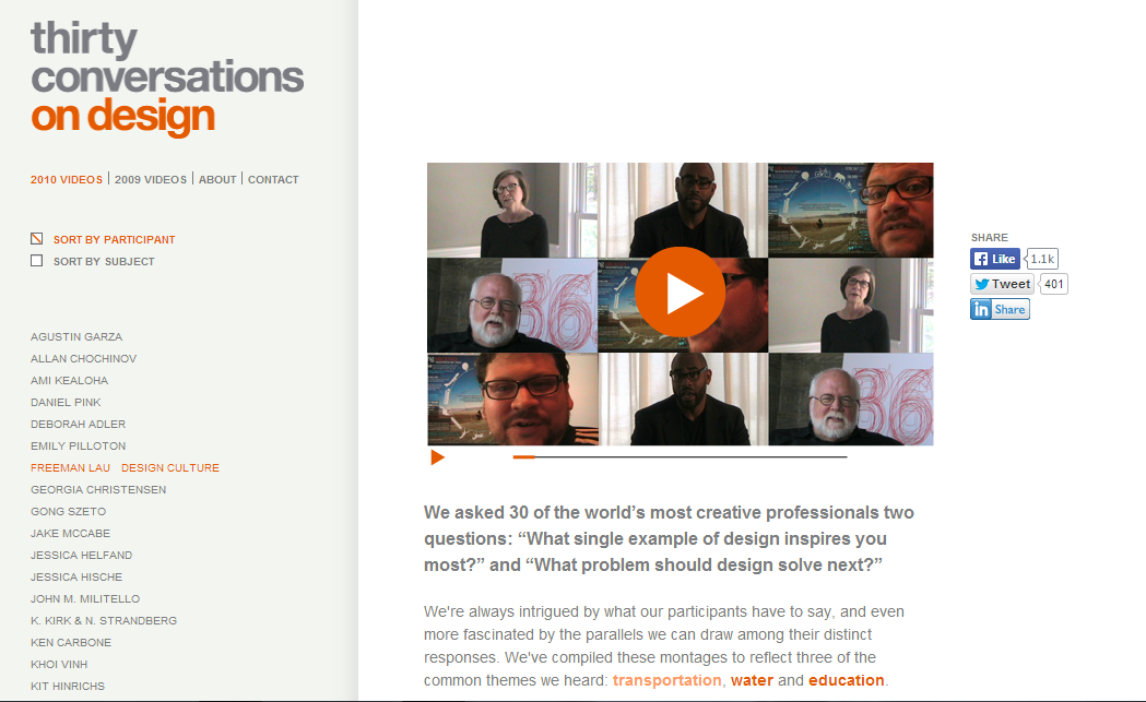
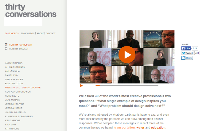
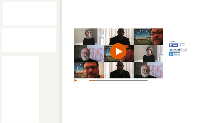
I visit this website quite often and have always noticed its intentionally minimal design it is a good example of how content is the highest priority rather than a lot of websites focusing on the overall brand/theme of a site.  


The first section of text I was drawn to was the 'on design' at the top left of the page. The positioning of this text and the colours contributed to this as it is naturally that part of the page the viewer would be expecting to read from. The dark grey didn't stand out as much as the orange did. 


The bold paragraph under the video which was a title for the video stood out after that due to the point size and boldness of the font.


I read the text providing links to the other speakers after because the title I had just looked at didn't particularly interest me. However if I was looking at it in terms of the boldness and shape of the two bodies of text the section below the title would have come above it in the hierarchy the text in bold and orange being read first.


The final type was the small links under the main title. Despite them being written in a bold and orange typeface the size was to small and they were squashed in under the main title which drowned it out.

Dangerous Minds


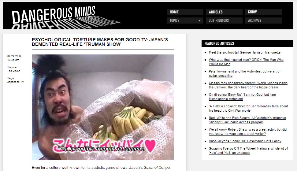
First thing on this page was the 'Dangerous Minds' title header. This was because it was the largest font and white on an black background which created a high contrast.


The next piece of type in this websites hierarchy was the bold black heading it is in all caps and centred below the header.  


The Home/Articles/Show tabs were after this as they were the next largest font and stood out against the black banner. They are also surrounded by a lot of space making it easier to distinguish their shape.


Next was the type beneath for the same reasons as before however the darker grey didn't make them stand out as much and they were positioned below. 


Last was the links to other articles as they were the smallest font pushed to the right hand side of the page. 


Secret 7" First Ideas - Age of Reason Black Sabbath

Lyrics 

I started by quickly generating words that associate with the song which I could possibly base my ideas off. 

Do you hear the thunder, raging in the sky?
Premonition of a shattered world that's gonna die
In the age of reason, how do we survive?
The protocols of evil ravage through so many lives
So many lives (x2)

Mystifying silence, talking peace on Earth
We should just join for ourselves, not what we're worth
Sustainable extinction, a fractured human race
A changing revolution disappears without a trace
Without a trace (x2)
Alright yeah!

Always felt that there'd be trouble
Mass distraction hides the truth
Prozac days and sleepless hours
Seas of change that don't bear through

Oh yeah!
These times are heavy
And you're all alone
The battle's over, but the war goes on
Politics, religion, love of money too
It's what the world was built for
But not for me and you, oh yeah!


Sabbath

Sabbath is generally a weekly day of rest or time of worship. It is observed differently in Abrahamic religions and informs a similar occasion in several other practices. Although many viewpoints and definitions have arisen over the millennia, most originate in the same textual tradition. The term has been used to describe a similar weekly observance in any of several other traditions; the new moon; any of seven annual festivals in Judaism and some Christian traditions; any of eight annual pagan festivals (usually "sabbat"); an annual secular holiday; and a year of rest in religious or secular usage, originally every seventh year.


The themes involved in the song centre around revolution and a new age. The existing world is shattering and so is civilisation. I have decided to focus my ideas toward planets, moons and astronomy because these words came up prominently in the mind maps.   

Starting Themes

Revolution, New Age, Order, Reason, Hidden, Eclipse, Dawn, Revolve, 7 Days, Unusual World, Fractured Planet


A Sabbath is determined in some religions when the moon has completed its cycle. It also links to the song as it is revolving around the earth a changing each day which could connote revolution. I have also looked at revolution in a more literal meaning to revolve or spin like planets and a vinyl record.  


Above I have tried to illustrate the idea of something revolving and coming full circle showing stages in a gradual change.