Wednesday 19 November 2014

Monotype - 80s Typography (Responsive)

After looking further into 80s design trends I picked out a few adverts with type that stood out to me. A common text effect was to extrude it as if it was literally jumping off the page - an obvious way of grabbing viewers attention. 


These adverts have a distinctive style which I want to play on when I start working on my type. I want to find a way of combining this retro/vintage design (to pay homage to the original films and to give my designs contextual reference) with more contemporary design processes.        


Tuesday 18 November 2014

Monotype - Horror/Sci-Fi Film Posters/Typography (Responsive)

I Googled horror movie posters to get an overview of the type and images currently used. As you can see they make use of similar typefaces/colours/images which makes them bland and merge into one. 


Logotypes from 80s Films

Individual logotypes were often created for films made in the 80s giving each film its individual visual identity. I believe that this is part of the reason as to why the films have become so iconic- the type is instantly recognisable and doesn't need images to suggest what genre and what the film is about. 


Science fiction films also had their own logos which are in a style of their own yet still distinctive today. Some typefaces have been created using the letters from the original logos. Bold angular sans-serif fonts were often used and packed closely together with futuristic strikethroughs. 


Current & Recent Film Posters

As shown by a few of the titles below the type used is nowhere near as imaginative as it used to be. A lot of the posters I looked at used similar if not the same typefaces and weren't the focal point of the posters.   


It is is clear that designers for these posters seem to be following a design formula which is making type used in film poster design generic and is what I want to stay away from when starting my own type experiments. 


Friday 14 November 2014

Monotype Brief - John Carpenter (Responsive)

John Carpenter

Although Carpenter has worked in numerous film genres, he is most commonly associated with horror and science fiction films from the 1970s and 1980s.


Most films in Carpenter's career were critical and commercial failures, with the notable exceptions of Halloween (1978), Escape from New York (1981) and Prince of Darkness (1987). However, many of Carpenter's films from the 1970s and the 1980s such as Dark Star (1974), Assault on Precinct 13 (1976), The Fog (1980), The Thing (1982), Starman (1984), Big Trouble in Little China (1986) and They Live (1988) have since been seen as cult classics, and Carpenter has been acknowledged as an influential filmmaker (Wikipedia).


My aim for this project is to revive some of these cult classic horrors by rejuvenating them and introduce wider audiences who wouldn't have experienced them the first time. One of the thing that make these films distinctive is the era they were made in (1980s). This is a decade I am particularly interested in as it was the start of commercial digital advertising and computer generated design.     


All the images above the films original advertisements from the 80s.


The films I have chosen to include in my retrospective screening are: 

- The Fog (1980)
- The Thing (1982)
- They Live (1988) 

Images/Inspiration from the original films  


The Thing and The Fog have both had fairly bland and unimaginative remakes since and by doing so have hidden the original films even further. Most of the younger generation would most likely choose the newer versions because of the updated effects, cast and current advertising. 

Remake posters: 


The new posters look bland using typical colours and composition and aren't as interesting when compared to the originals.  


Tuesday 11 November 2014

Design for Print Workshop

Design for Print

Considerations for preparing digital artwork or layout that will be commercially printed.

Commercial Print

Offset Lithography 
Digital Printing
Screen Printing

Colour Swatch


When a colour has been selected a swatch can be made by clicking the 'new swatch' button in the swatch panel. This brings up a window that allows you to adjust the the colours through CMYK or RGB depending on how the end product will be viewed. 

'Global' means that any change to the colour will be applied across all artwork. 


'Global' gives a tint menu on colour, and will show the percentage of colour when a new swatch is made.
'Global' will also also all the tints to change colour when one is changed.


How do we access spot colours in illustrator?

Colour books ie Pantone swatches, which are all spot colours because they are specific.


The colour code can be typed in to find the exact swatch, which can be added easily to the swatch palette.


Friday 7 November 2014

Websites Grid System Digital Mockups/User Experience (SB3)

What is user experience and how does this apply to your website?

User experience design is about what people would be interested in using my website for and how I want people to interact with my website. My design is centred around the content as I expect users would find the site through search links and keywords. Although I want the site to be informative I don't want it to be overwhelming, certain pages users will be able to interactive with and will provide links to external sites if they are wanting to know more. This means that my design aesthetic will be clean and functional but the use of type, animation, images and logo will keep anyone using it engaged.

How does the user experience of your website relate to other similar or competing sites?

The experience of my website relates to other similar sites in terms of how the content is categorised. The information however will be displayed more clearly and efficiently - and updated more frequently than other competing sites such as Art of the Title 

What are 'personas' and how can you use these for your web project?
Personas describe a specific person who acts as an exemplar of a particular group. They are based on tasks behaviours and attitudes of users. 

I can use these to identify the types of people than will be using my site. I may help me to anticipate the content they are looking for and prioritise the information  

The Grid 

Based around 3 of the 5 columns leaving a large border to space out the content. As the site is mainly about providing a platform which displays its information clearly the use of space is important as it allows the user to digest the information easily and navigation is simple. The four pages include featured, gallery, about and history pages which contain images, text and video.  


The about page is a summary of what the sites purpose is and any external links which may be needed. 


Gallery will hold a large range of stills from selected title sequences with information about them.


If the website was to go live this would be updated on a regular basis showing new title sequences, exposing artists and designers and interviews.   


Typeface


I chose to use this typeface as its a slightly alternative to sans-serif fonts regularly used such as Gotham, Helvetica and Avenir. I have seen the font on a website I previously looked at and found it to work successfully however as it isn't a web safe font I will need to install it through @font-face. Alternatively Helvetica Neue Ultra Light or Helvetica Light can be used.    

Crit Feedback

- Avoid dark background, keep just the navigation bar black.
- Align text at top with text on page.  

To expand on the crit and before I made any final decisions I asked a few others in the studio for some feedback and preferences, some issues were:

- Body text not the easiest to read in large chunks because of shape of some of the letters in typeface.
- Current colours are used on other sites (BBC iPlayer).
- Typeface in logo should be involved in rest of pages to make design consistent. 


Links will use a hover colour and stay highlighted when clicked on to identify the page.

Made a few adjustments after the crit, did plan to have a colour for the background but couldn't find a suitable web safe grey so decided to stay with white which links to the white in the logo. 

Final Design  

Pages are ready to be coded. I am pleased with the designs and how they work as a set of pages. I am expecting there to be some problems when coding as it is an area that is completely new to me. 


Landing page will be a simple introduction to the site. Will show the logo and have an arrow so users can progress onto the rest of the site. I want to animate the logo as the page opens and animate the arrow as well so it attracts more attention and entices people to click to continue to the rest of the site.  


For the featured page I have ordered the info so I can easily edit the different sections such as the designers and studios involved.


Page Info

Font

Header Text Links/Subheading: Raleway Extra Light, 10pt

Page Title: Raleway Extra Light, 24pt

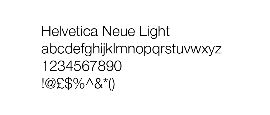
Body Text: Helvetica Neue Light, 10pt 

Colour 

Nav Bar: #333

Background: #000

Body Text/Headings: #333

Link Colour Hover: #FF6699

Link Colour Active: #FF6699

Link Colour Default: #000

Added Content 


One thing I decided to add at the final stage was a hover animation where the name of the film would come up before the user clicks through to the link. If I had more time on this brief I would have created more pages that have info about individual sequences that can been linked to the Gallery page.