What is user experience and how does this apply to your website?
User experience design is about what people would be interested in using my website for and how I want people to interact with my website. My design is centred around the content as I expect users would find the site through search links and keywords. Although I want the site to be informative I don't want it to be overwhelming, certain pages users will be able to interactive with and will provide links to external sites if they are wanting to know more. This means that my design aesthetic will be clean and functional but the use of type, animation, images and logo will keep anyone using it engaged.
How does the user experience of your website relate to other similar or competing sites?
The experience of my website relates to other similar sites in terms of how the content is categorised. The information however will be displayed more clearly and efficiently - and updated more frequently than other competing sites such as Art of the Title
What are 'personas' and how can you use these for your web project?
Personas describe a specific person who acts as an exemplar of a particular group. They are based on tasks behaviours and attitudes of users.
I can use these to identify the types of people than will be using my site. I may help me to anticipate the content they are looking for and prioritise the information
The Grid
Based around 3 of the 5 columns leaving a large border to space out the content. As the site is mainly about providing a platform which displays its information clearly the use of space is important as it allows the user to digest the information easily and navigation is simple. The four pages include featured, gallery, about and history pages which contain images, text and video.
The about page is a summary of what the sites purpose is and any external links which may be needed.
Gallery will hold a large range of stills from selected title sequences with information about them.
If the website was to go live this would be updated on a regular basis showing new title sequences, exposing artists and designers and interviews.
Typeface
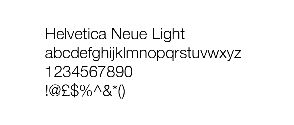
I chose to use this typeface as its a slightly alternative to sans-serif fonts regularly used such as Gotham, Helvetica and Avenir. I have seen the font on a website I previously looked at and found it to work successfully however as it isn't a web safe font I will need to install it through @font-face. Alternatively Helvetica Neue Ultra Light or Helvetica Light can be used.
Crit Feedback
- Avoid dark background, keep just the navigation bar black.
- Align text at top with text on page.
To expand on the crit and before I made any final decisions I asked a few others in the studio for some feedback and preferences, some issues were:
- Body text not the easiest to read in large chunks because of shape of some of the letters in typeface.
- Current colours are used on other sites (BBC iPlayer).
- Typeface in logo should be involved in rest of pages to make design consistent.
Links will use a hover colour and stay highlighted when clicked on to identify the page.
Made a few adjustments after the crit, did plan to have a colour for the background but couldn't find a suitable web safe grey so decided to stay with white which links to the white in the logo.
Final Design
Pages are ready to be coded. I am pleased with the designs and how they work as a set of pages. I am expecting there to be some problems when coding as it is an area that is completely new to me.
Landing page will be a simple introduction to the site. Will show the logo and have an arrow so users can progress onto the rest of the site. I want to animate the logo as the page opens and animate the arrow as well so it attracts more attention and entices people to click to continue to the rest of the site.
Page Info
Font
Header Text Links/Subheading: Raleway Extra Light, 10pt
Page Title: Raleway Extra Light, 24pt
Body Text: Helvetica Neue Light, 10pt
Colour
Nav Bar: #333
Background: #000
Body Text/Headings: #333
Link Colour Hover: #FF6699
Link Colour Active: #FF6699
Link Colour Default: #000
Added Content
One thing I decided to add at the final stage was a hover animation where the name of the film would come up before the user clicks through to the link. If I had more time on this brief I would have created more pages that have info about individual sequences that can been linked to the Gallery page.


No comments:
Post a Comment