Friday 28 March 2014

Bandits (Screen Print)


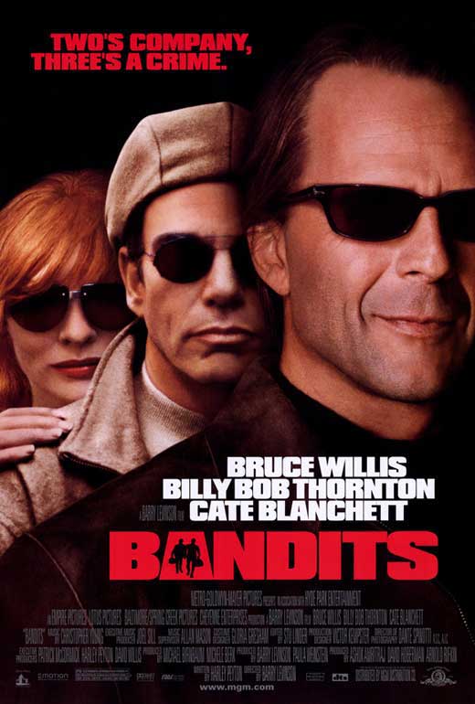
The poster I have been given for this brief is Bandits. I haven't seen the film but plan to take some design ideas from looking at the existing posters and trailers as a starting point before watching the whole thing. 

Theme of 3 - There is a use of three in the trailer in the way that each of the characters are introduced and the three of their names showing up. This is also on the poster, the three characters headshots and not much else. The tagline 'Two's company, three's a crime' also puts emphasis on the use of three. 

From what I can tell by watching the trailer the film has gone for a western themed approach. Two criminals at large with a bounty on them.  


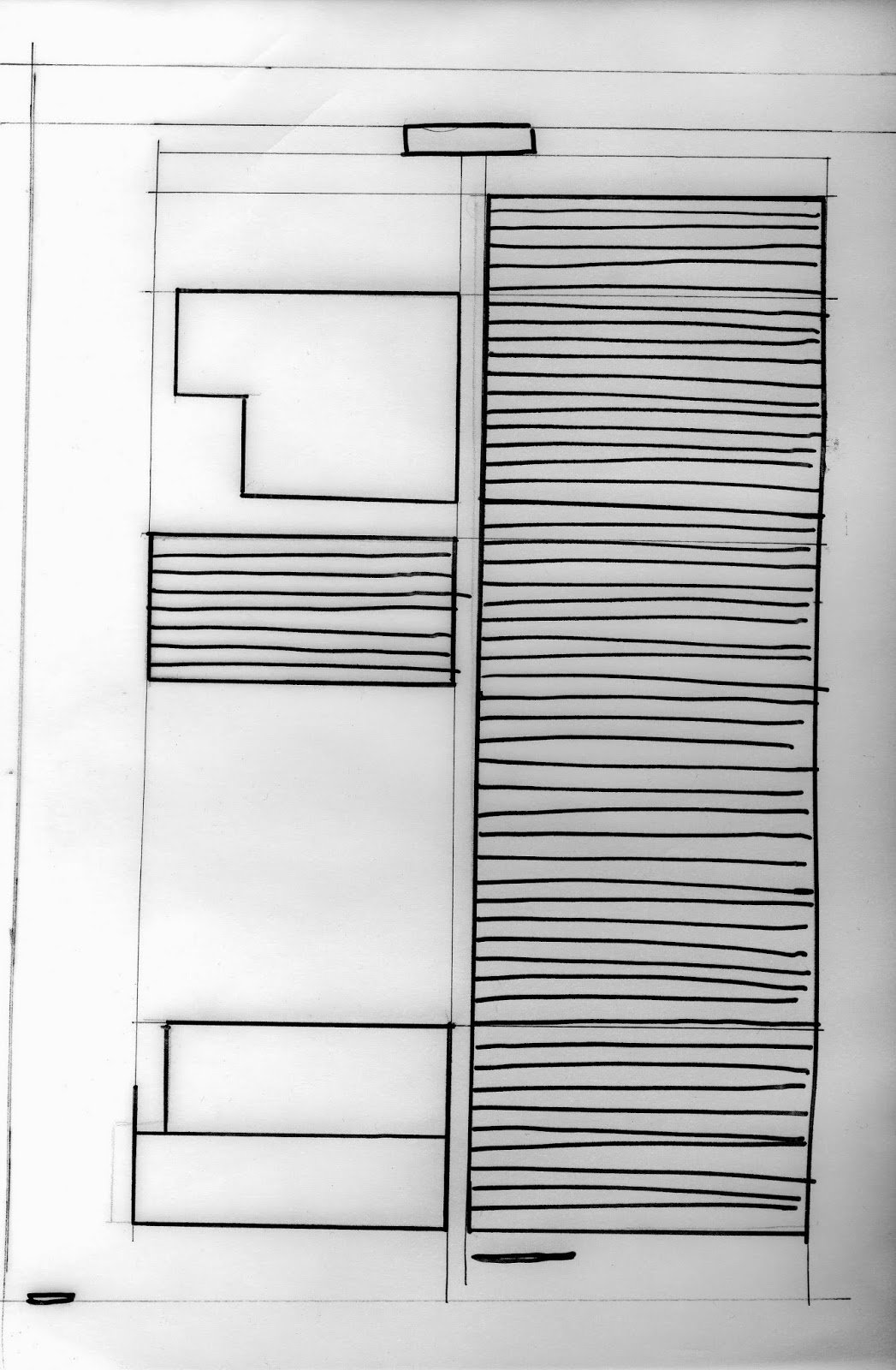
First idea was to create a bounty poster using the characters and title of the film to replace the typical text. Below are some quick thumbnail sketches working with items and themes from the trailer.


From here I can start I create some more detailed designs for the crit presentations and find which is the most successful.    


Monday 24 March 2014

Secret 7" Exhibition

The design I submitted for Secret 7 was chosen to be in Mother London's exhibition in April and then sold on record store day. It is a great opportunity to get some of my work out there alongside some big designers and perhaps get some exposure.


Monday 17 March 2014

OUGD404 Double Page Spreads: Pantone


How does pantone work?


The Pantone solid colour system, with over 1100 unique, numbered colours, was originally devised to help printers and designers specify and control colours for print projects. This is the most widely used Pantone palette, with colours sometimes referred to as 'PMS' (for Pantone Matching System) or 'spot colours', and is used in the graphics, print, and publishing, industries.

Pantone is very useful for matching colours across various designs, this is very important when dealing with branding as you want the colours to be continuos across all the designs. For example coke will use pantone to make sure they have a continuous brand across different products and limited addition variations.


There isn't just one library for colour matching with pantone there are coated, uncoated and matte pantone libraries. These are all effected by the type of stock or what the colour is printed on. This is the same with the red used for coke as it will change if its printed on billboards for advertising or printed onto the can.


Some of the Pantone Colours can be reproduced by mixing CMYK inks while others must be pre-mixed inks. Pantone has guides for their spot colours (called "Solid" or premixed ink colours by Pantone) and guides which show the Process colours. Samples in the process guides are therefore colours achievable through mixing CMYK (or "process") inks. A special guide also shows you the spot colour and how it will look printed in CMYK along with CMYK values. This way, if spot colours, which are an added expense at print time, cannot be used, close colours may be mixed in process.


Thursday 13 March 2014

OUGD404 Grid Thumbnails

Continuing on from last weeks session we started to experiment by sketching out thumbnail layouts for the double page spreads we had looked at and started to rearrange the information. This process can help when designing our own DPS.


Using paper we drew out a 34cm x 24cm rectangle, with a diagonal line across the page. From this we were able to resize the rectangle, keeping the ratio consistent no matter what size we made it. 
[image]

I then divided the spread into six columns giving me more room to experiment and drew a centre line. I added gutters and margins  


Huck Magazine

Mapped out the different sections of the content (images, body text, headings, subheadings, headers/footers). The image below is from on side of the magazine I previously drew the grid for.


Drew thumbnail sketches showing where the text, image, and headings were on the page. The rough sketch above shows the position of images and text on one side of a double page spread. Below is where I have rearranged the content to get an idea of what works the best and what is the most interesting.  


City Talking Magazine

Looked at mapping the grids for a larger magazine which uses a more complex grid system than the previous magazine consisting of 12 columns.


I dislike the layout on these pages because of the images that bleed over the margins and the positioning of the content. The layout doesn't vary much across the double page spread. The body copy falls into three columns with the heading and middle section across two.


Re-arranged the content on at first an eight column spread then three to show other alternatives and to get used to the possible combinations and ways of presenting the information. 


Using the content me and my group had gathered throughout the brief I began to experiment with ways I could arrange the information. I used the method of drawing out scaled down thumbnails to get an idea of which layouts are most effective.   


Wednesday 12 March 2014

OUGD404 Grid Systems

Single Column Grid

Every time you open a new document in a page layout program, you are prompted to create a grid. The simplest grid consists of a single column of text surounded by margins. By asking for page dimensions and margin widths from the outset, layout programs encourage you to design your page from the outside in. (The text column is the space left over when the margins have been subtracted.) Alternatively, you can design your page from the inside out, by setting your margins to zero and then positioning guidelines and text boxes on a blank page. This allows you to experiment with the margins and columns rather than making a commitment as soon as you open a new document. You can add guidelines to a master page after they meet your satisfaction.


Books and magazines should be designed as spreads (facing pages). The two-page spread, rather than the individual page, is the main unit of design. Left and right margins become inside and outside margins. Page layout programs assume that the inside margins are the same on both the left- and right-hand pages, yielding a symmetrical, mirror-image spread. You are free, however, to set your own margins and create an asymmetrical spread.
Modular Grid

A modular grid has consistent horizontal divisions from top to bottom in addition to vertical divisions from left to right. These modules govern the placement and cropping of pictures as well as text. In the 1950s and 1960s, Swiss graphic designers including Gerstner, Ruder, and Müller-Brockmann devised modular grid systems like the one shown here.


Multicolumn Grid 


Multicolumn grids provide flexible formats for publications that have a complex hierarchy or that integrate text and illustrations. The more columns you create, the more flexible your grid becomes. You can use the grid to articulate the hierarchy of the publication by creating zones for different kinds of content. A text or image can occupy a single column or it can span several. Not all the space has to be filled.

Wednesday 5 March 2014

OUGD404 Double Page Spread: Woodblock Type

The Foundation of Typographic Design
Typography in western culture happens simultaneously on two visual levels. The macro level of overall composition guides our eyes around a format, and the micro level of minute details provides the basis for how we perceive the big picture. (Bigger font under header) 

The Roman alphabet used in Western Typography can be understood as a system of line drawings. The drawing of different letters is archetypal; each form has been steadily codified and passed along over the generations. The archetypal form of a particular letter is what distinguishes it from other letters and makes it recognisable. Letterforms are iconic, so integrated into Western conciousness that their visual form holds sway over the perception of other images- many objects remind us of letters. Its visual qualities drive modern typography at every level. 

The Anatomy of Letterforms


Being able to recognise tiny differences between letterforms helps designers understand what makes letters act a certain way. Sharper serifs lend different texture to lines of text than do slab serifs. At larger sizes, the smallest details in a letter are exaggerated.

Woodblock

Woodblock printing is a technique for printing text, images or patterns used widely throughout East Asia and originating in China in antiquity as a method of printing on textiles and later paper. As a method of printing on cloth, the earliest surviving examples from China date to before 220, and woodblock printing remained the most common East Asian method of printing books and other texts, as well as images, until the 19th century. Ukiyo-e is the best known type of Japanese woodblock art print. Most European uses of the technique for printing images on paper are covered by the art term woodcut, except for the block-books produced mainly in the 15th century.

The oldest existing print done with wood-blocks is the Mugujeonggwang great Dharani sutra that is dated between AD 704 and 751. It was found at Bulguksa, South Korea in 1966.[9] Its Buddhist text was printed on a 8 cm × 630 cm (3.1 in × 248.0 in) mulberry paper scroll in the early Korean Kingdom of Unified Silla.


How is woodblock type traditionally made?


Wood engravings are a form of relief printing. The starting point would be a hard block of wood that would create a solid shape when printed. The letterforms are created by wood been cut away from an outline leaving a final image. The other common relief printmaking methods are the woodcut and linoprint methods.
All engravings start with a drawing. The image you cut into the block needs to be the reverse output of the final print. This means when the print is pressed the letterform appears the right way round. A good tip would be too create mockups on acetate so the actual print outcome can be viewed on the other side of the acetate.
The block engraving. The wood that you intent to use needs to be cut across the end grains of the block. The depth of the block is normally the height of the letterform. The traditional wood to use for wood engraving is boxwood, alternatives could be lemonwood. The wood needs to be capable of coping with fine detail and be robust enough to withstand many prints.
There are 2 methods of drawing onto the block. You can draw onto the natural wood block, or you can cover the block in watercolor wash and draw on in pencil. Its a good idea to use tracing paper before hand to plan on were to place the visual elements onto the block.
Using typical woodcarving tools like; spitsticker for curved lines. A scorper for straight lines and large surface areas. A tint tool for parallel lines.A lozenge graver for cutting lines of varying widths. The multiple tool cuts several parallel lines at once.
After lots of patience the block glyph is finished with sandpaper for curved elements of the letterform.


The block is ready for printing now, good quality printing paper is recommended. Strong thin paper like a Japanese paper is the traditional medium.
In terms of a printing press it can be done by hand for a more worn out rustic effect. Or a proof press or a typical letterpress were moveable type can be placed in the pressing tray.
Woodblock type to me always has a very similar aesthetic its big and bold and i think this comes from the production method of the type.

Tuesday 4 March 2014

OUGD404 Colour Theory [2]

During this session we were tasked with comparing a coloured object to different colour papers. Making note of the different contrasts and how surface texture, space the colour took up and lighting affected our perception of the colours.


As the bottle top is small and surrounded by a large space of background colour there is a high contrast of extension across the images making the yellow look more saturated. 


A low contrast of Hue makes the yellow seem less saturated against the orange card. 


Slight contrast of tone and saturation between the gloss texture of the bottle top which reflects more light and the matt card which absorbs it.


A contrast of tone as the red is much darker making the yellow look much more vibrant.