How does pantone work?
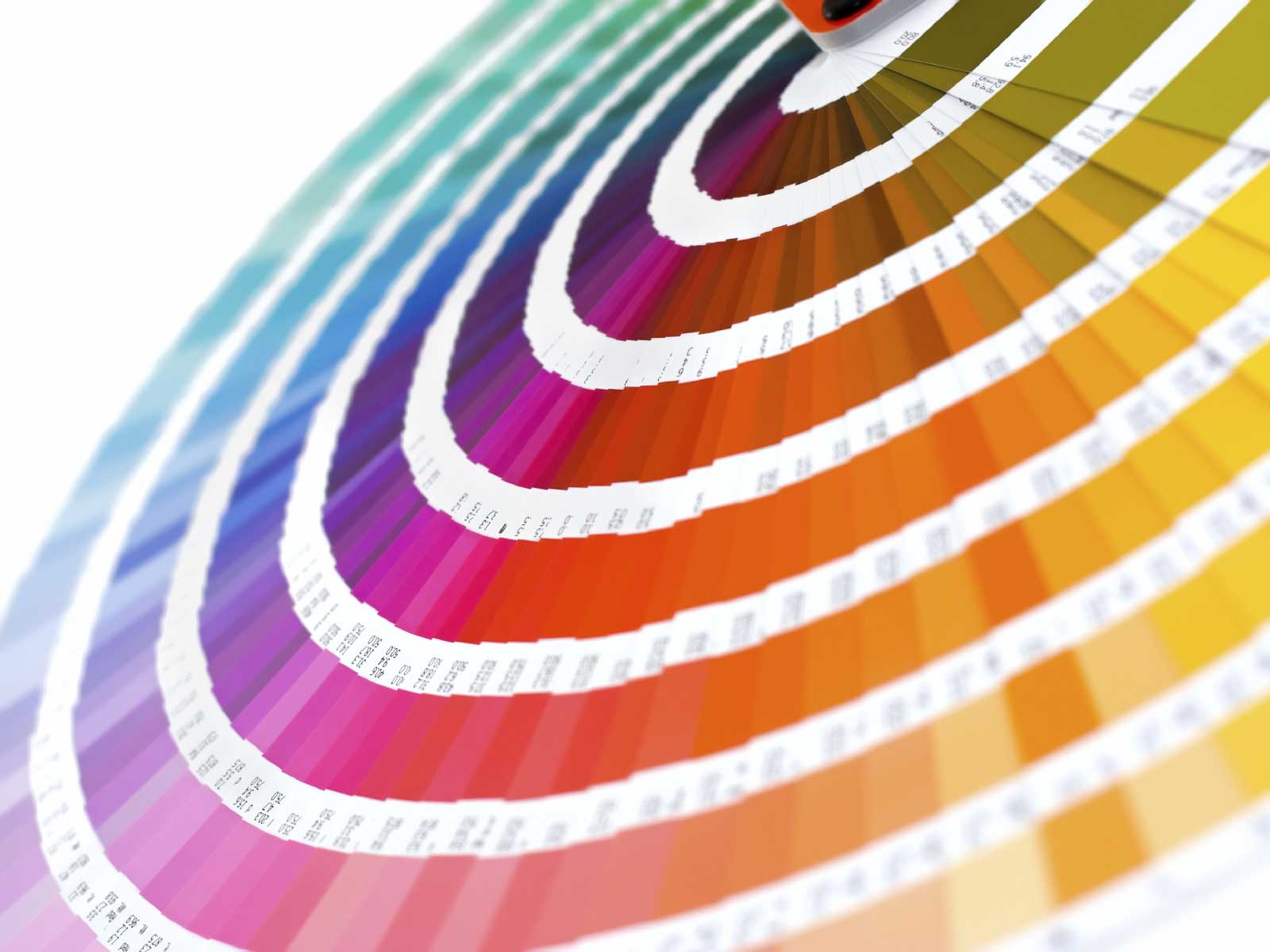
The Pantone solid colour system, with over 1100 unique, numbered colours, was originally devised to help printers and designers specify and control colours for print projects. This is the most widely used Pantone palette, with colours sometimes referred to as 'PMS' (for Pantone Matching System) or 'spot colours', and is used in the graphics, print, and publishing, industries.
Pantone is very useful for matching colours across various designs, this is very important when dealing with branding as you want the colours to be continuos across all the designs. For example coke will use pantone to make sure they have a continuous brand across different products and limited addition variations.
Pantone is very useful for matching colours across various designs, this is very important when dealing with branding as you want the colours to be continuos across all the designs. For example coke will use pantone to make sure they have a continuous brand across different products and limited addition variations.
Some of the Pantone Colours can be reproduced by mixing CMYK inks while others must be pre-mixed inks. Pantone has guides for their spot colours (called "Solid" or premixed ink colours by Pantone) and guides which show the Process colours. Samples in the process guides are therefore colours achievable through mixing CMYK (or "process") inks. A special guide also shows you the spot colour and how it will look printed in CMYK along with CMYK values. This way, if spot colours, which are an added expense at print time, cannot be used, close colours may be mixed in process.
No comments:
Post a Comment