During this session we were tasked with comparing a coloured object to different colour papers. Making note of the different contrasts and how surface texture, space the colour took up and lighting affected our perception of the colours.

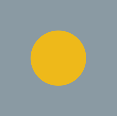
As the bottle top is small and surrounded by a large space of background colour there is a high contrast of extension across the images making the yellow look more saturated.

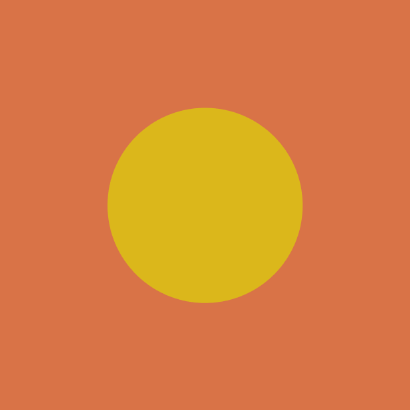
A low contrast of Hue makes the yellow seem less saturated against the orange card.

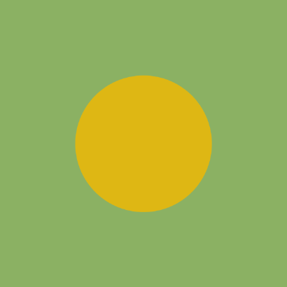
Slight contrast of tone and saturation between the gloss texture of the bottle top which reflects more light and the matt card which absorbs it.

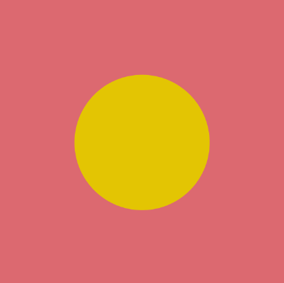
A contrast of tone as the red is much darker making the yellow look much more vibrant.
No comments:
Post a Comment