Continuing on from last weeks session we started to experiment by sketching out thumbnail layouts for the double page spreads we had looked at and started to rearrange the information. This process can help when designing our own DPS.
[image]
I then divided the spread into six columns giving me more room to experiment and drew a centre line. I added gutters and margins
Huck Magazine
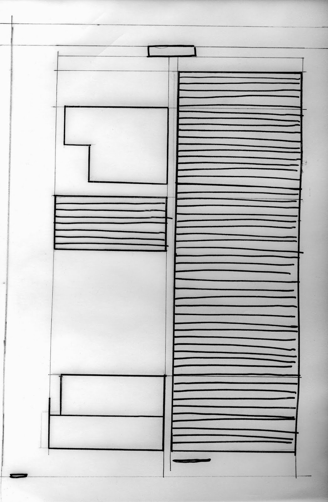
Mapped out the different sections of the content (images, body text, headings, subheadings, headers/footers). The image below is from on side of the magazine I previously drew the grid for.


City Talking Magazine
Looked at mapping the grids for a larger magazine which uses a more complex grid system than the previous magazine consisting of 12 columns.

I dislike the layout on these pages because of the images that bleed over the margins and the positioning of the content. The layout doesn't vary much across the double page spread. The body copy falls into three columns with the heading and middle section across two.

Re-arranged the content on at first an eight column spread then three to show other alternatives and to get used to the possible combinations and ways of presenting the information.

Using the content me and my group had gathered throughout the brief I began to experiment with ways I could arrange the information. I used the method of drawing out scaled down thumbnails to get an idea of which layouts are most effective.


No comments:
Post a Comment