Tuesday 12 November 2013

OUD404 - Arranging Type

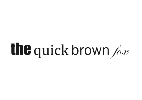
We were tasked in arranging our four different typefaces: block, gothic, script and roman into one sentence to see which words jumped out the most. As a group we generally found that the block font was the one which stood out the most when combined with the others, which is why it is commonly used titles and headings. 


It is clear from the image below that the block typeface (Impact) draws the eye and the least prominent is the script. 


Friday 8 November 2013

OUGD403 - Illustrator - Final Typeface

Regular


Light


The difficulty some people with speech disorders experience is what inspired this typeface. Speech disorders are characterised by difficulty in learning to produce sounds physically. The type which has been based on the font Futura features harsh cut off points to represent the sound of interrupted and stuttering sentences.


Friday 1 November 2013

OUGD404 Anatomy of Type


Cap Height - height of a capital letter above the baseline for a particular typeface

Baseline - line upon which most letters "sit"


x-Height - distance between the baseline and the mean line in a typeface where lowercase letters fit