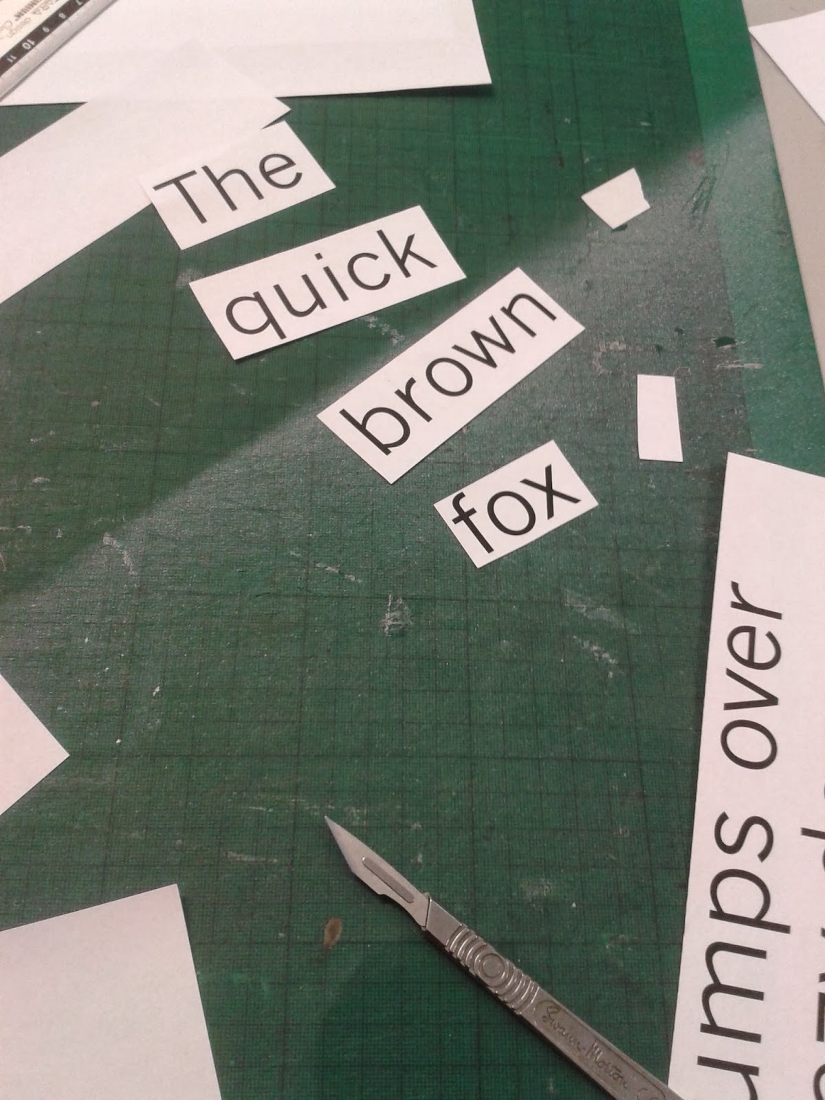
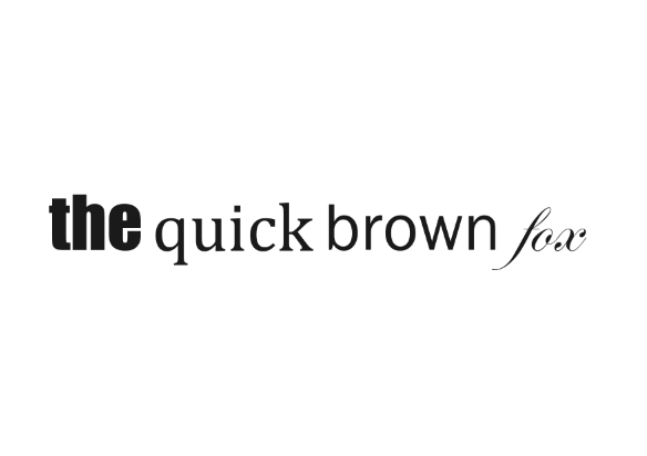
We were tasked in arranging our four different typefaces: block, gothic, script and roman into one sentence to see which words jumped out the most. As a group we generally found that the block font was the one which stood out the most when combined with the others, which is why it is commonly used titles and headings.
It is clear from the image below that the block typeface (Impact) draws the eye and the least prominent is the script.

No comments:
Post a Comment