The hierarchy of type on this website was effective in communicating what order of information the editors wanted you to focus on.
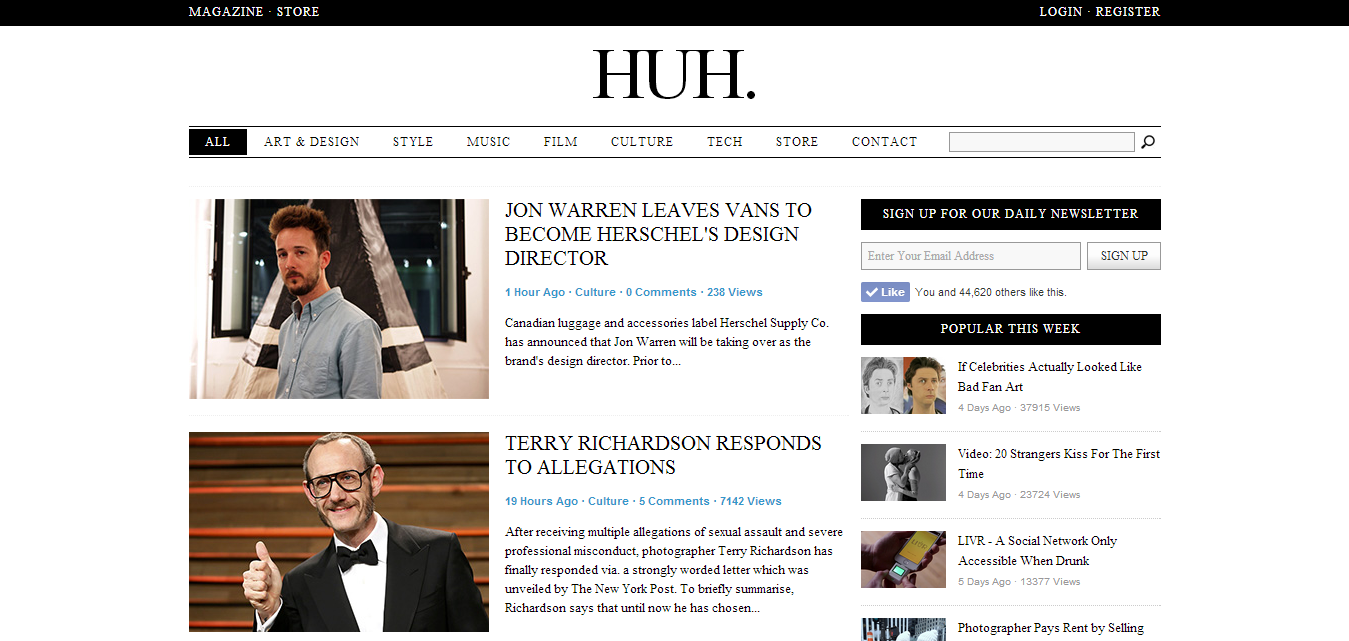
The first thing was the title of the site 'HUH' placed at the top centre of the page in the largest point size - this will help enforce the brand and make it clear what site you are using.
Next thing that stood out on the page was the news stories in the second largest font and leading directly down from the main header.
Looking at the page in a smaller format on this blog post makes the text in the black boxes stand out more as you start to see blocks and shapes opposed to text and they draw your eyes in.
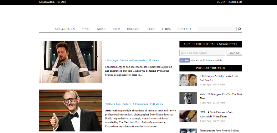
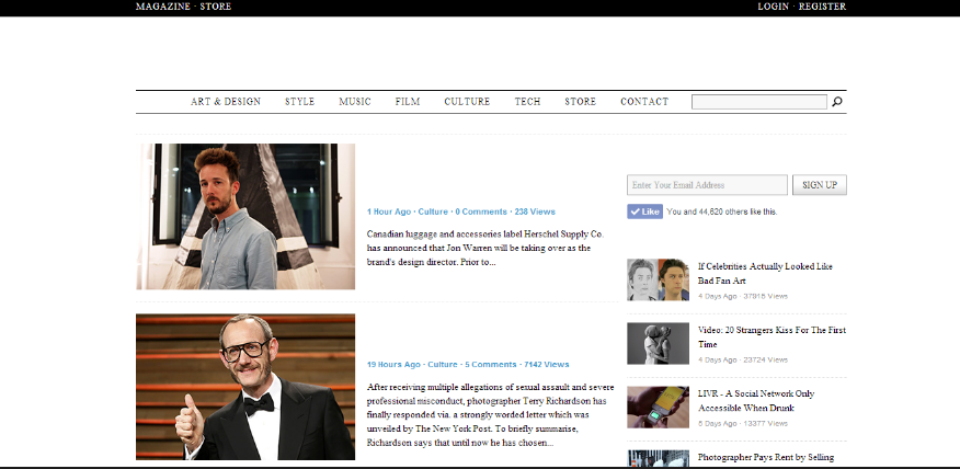
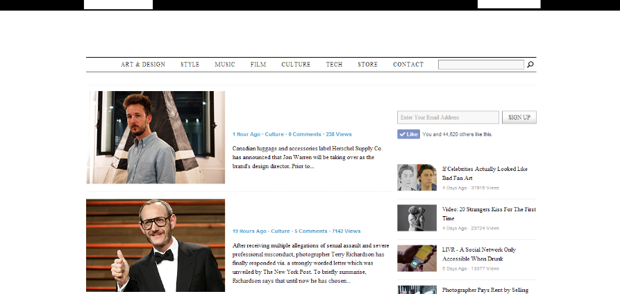
Before I read any of the stories or related articles on the side, the contrasting white text on black background at the top of the page grabbed my attention.
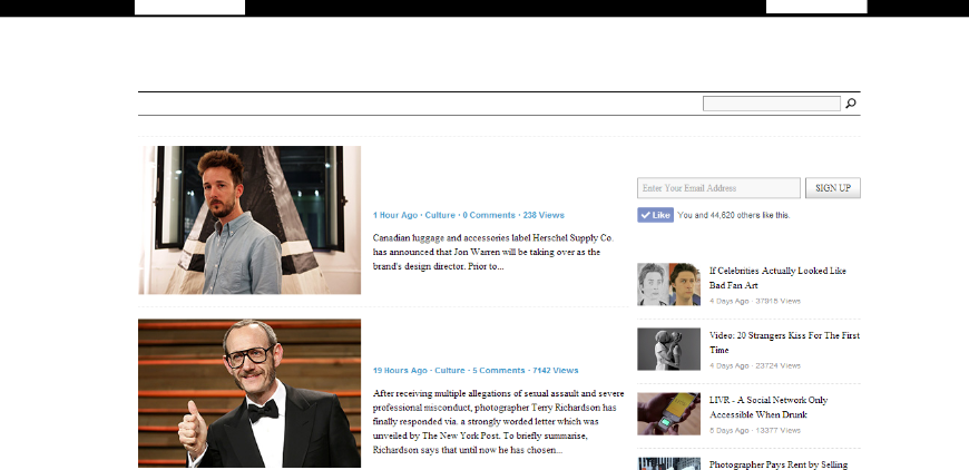
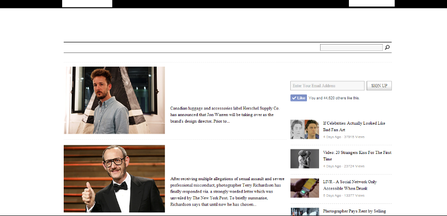
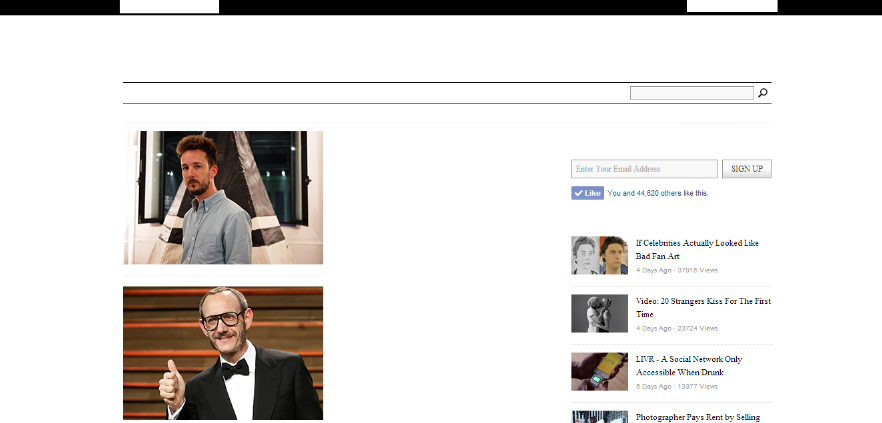
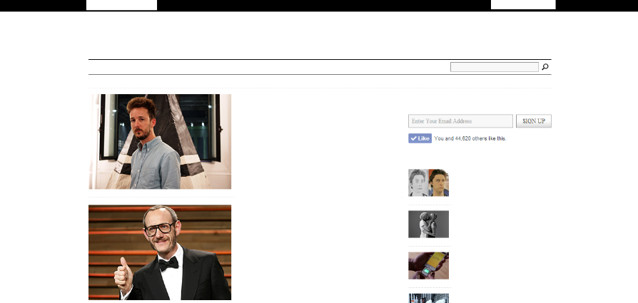
Finally the larger body of text at the bottom followed by the text beneath the other stories mostly in this order because they were at the far left of the page. The last place my eye would scan when reading.
Thirty Conversations on Design
I visit this website quite often and have always noticed its intentionally minimal design it is a good example of how content is the highest priority rather than a lot of websites focusing on the overall brand/theme of a site.
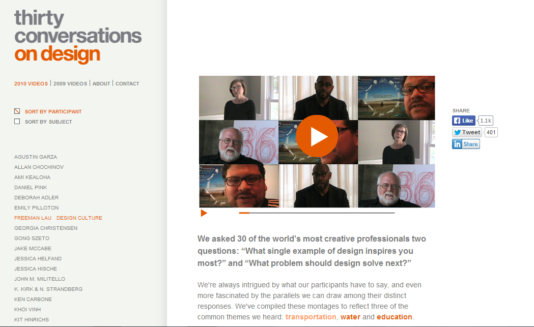
The first section of text I was drawn to was the 'on design' at the top left of the page. The positioning of this text and the colours contributed to this as it is naturally that part of the page the viewer would be expecting to read from. The dark grey didn't stand out as much as the orange did.
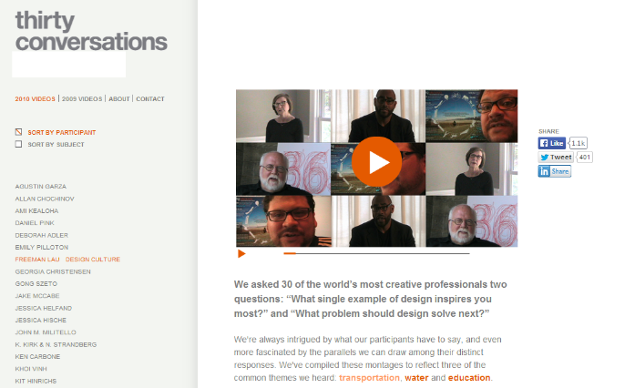
The bold paragraph under the video which was a title for the video stood out after that due to the point size and boldness of the font.

I read the text providing links to the other speakers after because the title I had just looked at didn't particularly interest me. However if I was looking at it in terms of the boldness and shape of the two bodies of text the section below the title would have come above it in the hierarchy the text in bold and orange being read first.
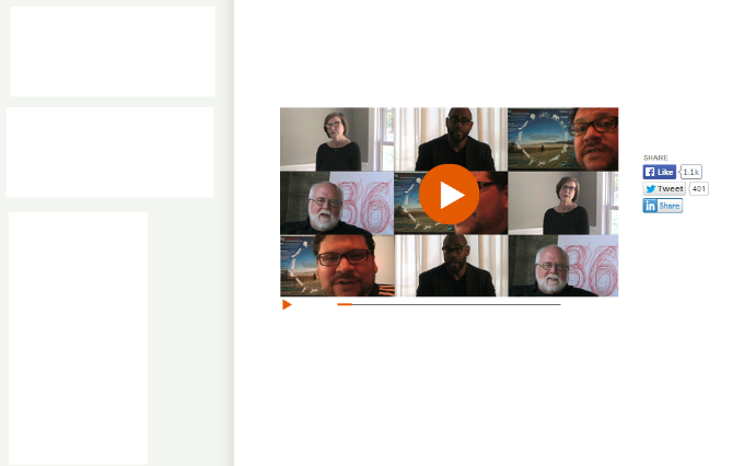
The final type was the small links under the main title. Despite them being written in a bold and orange typeface the size was to small and they were squashed in under the main title which drowned it out.
Dangerous Minds
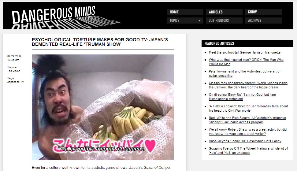
First thing on this page was the 'Dangerous Minds' title header. This was because it was the largest font and white on an black background which created a high contrast.
The next piece of type in this websites hierarchy was the bold black heading it is in all caps and centred below the header.
The Home/Articles/Show tabs were after this as they were the next largest font and stood out against the black banner. They are also surrounded by a lot of space making it easier to distinguish their shape.
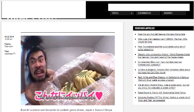
Next was the type beneath for the same reasons as before however the darker grey didn't make them stand out as much and they were positioned below.
Last was the links to other articles as they were the smallest font pushed to the right hand side of the page.
No comments:
Post a Comment