To gather some primary research we visited the Village Bookstore in the corn exchange in Leeds town centre. They had loads of independent zines along side books, magazines and leaflets to look through with lots of varied examples of page layouts which I photographed.

The book above uses a three column grid system that is centred on the page. There is a large amount of body copy which could seem overwhelming if not laid out correctly. However the use of a large margin and the small light font create a sense of space. The regular paragraph spaces make the text easier to read in segments, giving the reader an opportunity to pause and look at the images the text if referring to on the opposite side rather than it all being read at once.
The two images used on the facing page balance the layout by creating a good contrast to the text on the opposite side. The images appear to have been measured half and half on the page but maybe would have been interesting to see how they would have worked within the text boxes by adjusting the size of the images to stop where the text does.

Another page I found that has separated the text from image but work well together because of the positioning and alignment between the two. The black background makes these two pages standout in this book as most of the other pages were white which is what made me concentrate in this page when I was flicking through. The bold white text stands out on the page because of the contrast. The repeated text surrounding the image does't seem necessary as it is does't give out any information although may be relevant once reading the page.

Four columns have been used on this page as you can see two have been filled on one side using half the page. The photograph spreads across two sections until it reaches the 3rd column which has been left blank creating a clean break between type and image. The text was a series of questions where the questions were in bold and the answers in regular of the same typeface. This makes it easy to identify the questions and can be read before reading the answers which is the first thing I did when I looked at the text to get an idea of what was being talked about.

This page has been divided into sections to show the different parts of the page (heading, image, text + image). There is a large about of body text which has been split up by images and subheadings in a larger bold font and the line spacing is spaced appropriately to make the page less overcrowded and the text more readable. Every piece of text and image fit into the margins on the page giving it a solid structure. I don't like the small images wrapped around the text, they are quite difficult to see as it is a small booklet and they are detailed images.


These pages have been used to showcase the images primarily which I would like to do for my photograph page for the brief.
The pages use a single column which the text and image both fit into and are the same on both pages giving them an aesthetically pleasing look. The black and white photos were consistent throughout the zine which linked all the pages together.

There is a lot of content covered on these two pages and the format of the booklet seems to be smaller than the other magazines and books because the point size of the font seems larger. I think the text overlaid onto the image isn't necessary and makes that side look too busy. The type also becomes less legible as the colours from the image are distracting.
Grid Systems
I researched into different page layouts that use a grid system. The use of a grid system helps create page rhythm and consistency across pages with a variety of content.
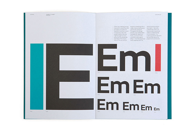
The booklet above has been crated by Font Smith to showcase a new typeface. The pages use four columns which all the type fits into and creates an aesthetically pleasing order to the page.

No comments:
Post a Comment