Arguments in favor of sans serif typefaces· Sans serifs are better on the web· Sans serif is better at small sizes. Sans serif fonts survive reproduction and smearing because of their simple forms. Sans serif is better for children learning to read.


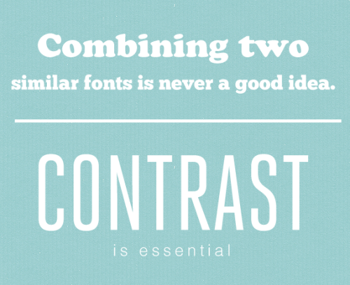
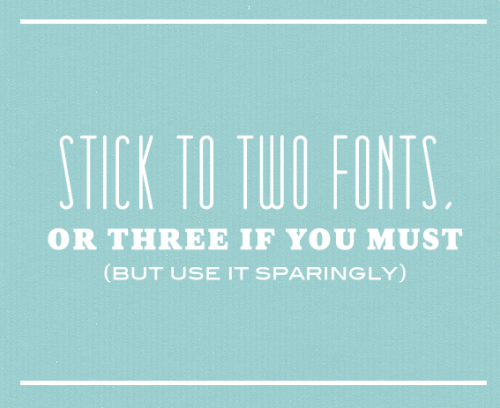
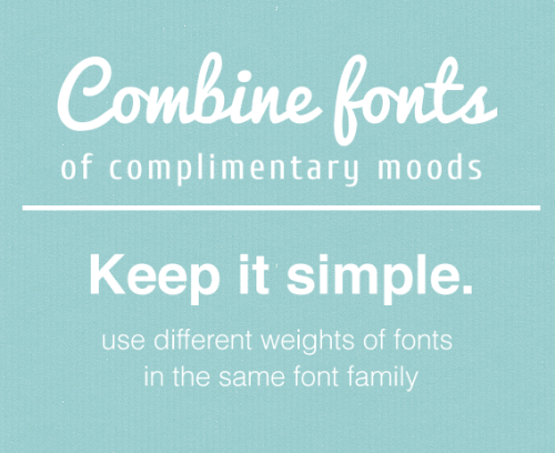
I also found an informative series of posters which showed good examples regarding
combining serif and san-serif and how to effectively use them.

http://visualgraphc.com/post/68889469714/fonts
No comments:
Post a Comment