Tuesday, 31 December 2013
Type Journal
Task
Document, Organise and Evaluate an ongoing investigation into type and typography using the principles, practices and examples introduced during the studio workshops as a starting point. You should aim to develop an increasingly individual resource type, letterforms, typography and texts relating to the creative, cultural and technical use of type in contemporary graphic design and broader visual culture. You should use the following themes as initial approaches to collect, categorise and compare type form a range of sources:
Production Methods - Stone, Sable, Bone , Wood, Lead, Silicon/digital, Hand Rendered, Stencil, Block Print
Anatomy - Line/Stroke weight, Serif, Curve/Apex, Terminals, Uppercase/Lowercase, Bold, Italic, Ascenders/Descenders,
Identity - Name, Designer, Historical, Chronological, Cultural, Humanist, Modern, Traditional, Context, Function
Character - delicate, contrats, Sophisticated, Playful, Childlike, Fun, Exciting, Minimal, Formal, Geometric, Balanced, Simple, Decorative, Feminine, Corporate, Industrial.
It essential that you see these as convenient starting points for your ongoing investigation. You should keep an ongoing record of your progress on your Studio Practice blog and label it with the module code, task number and a separate label 'Type Journal".
Considerations
Consider how you will source and record a range of examples websites, font foundries text books, magazines, photocopy, photography.
You will find that you will quickly identify a range of other possible lines of investigation and find new ways of organising your findings. If you identify other themes , make sure you define what they are and add them to the list above.
Sunday, 29 December 2013
OUGD405 - Studio Brief 2 - Clothing Brands
Collecting 100
To start my research about clothing brands I asked some questions to gather opinions. I aimed the questions to try and see how people would think about them personally when buying clothes.
'High-end companies will ensure superior quality in order to uphold their reputations. And if I get great shirts from a particular brand name, I also expect other products by the same brand to be well made. However, I’m not sure what I’m getting with no-name labels.'
To start my research about clothing brands I asked some questions to gather opinions. I aimed the questions to try and see how people would think about them personally when buying clothes.
I found an article online titled Brands vs No Brands which argued this issue well and raised some points as to why people would wear more expensive branded clothing opposed to cheap no-labels:
They referenced an american sit-com called 'The 70s Show' which is based on the life of a self centred, yet insecure teenager and picked out of quote from the show summing up her view as to why she wears branded clothing: "I am not insecure! This is a designer sweater, this is designer eye shadow, and those are designer shoes and they make me feel INCREDIBLY secure!"
I also found people will buy anything if it holds an association with something they are interested in (or obsessed with). An example of this is the plain white t-shirt hip hop artist Kanye West brought out and sold for $120 where the only personalisation was 'A.P.C KANYE' silkscreened on the inside neckline. The t-shirt however managed to sell out instantly.
Saturday, 28 December 2013
OUGD405 - Studio Brief 2 - Fashion
Fashion (definition) - a popular or the latest style of clothing, hair, decoration, or behaviour.
After coming up this some different approaches to the word fashion and the feedback I got from the crit I decided to focus of Fashion Brands and specifically logo design, name, type and advertising differs from the wide range of brands. I looked at how fashion has changed through time and how different styles can be associated with different time periods, people, professions and lifestyles.
I have began by looking into a wide range of fashion brands which sell products, clothing and accessories and found out their origins, reasons and influences behind their logos.
I have began by looking into a wide range of fashion brands which sell products, clothing and accessories and found out their origins, reasons and influences behind their logos.
Nike
The logo for Nike has been simplified over the years as the brand has become more popular. All that is needed on their products now is the swoosh logo as it has become one of the most recognisable brands of all time.

The logo is a 'swoosh' which represents movement in sport and has been consistent in their brand since 1971. The word Nike comes from the greek goddess of victory also appropriate to sport as the main objective across a large amount of sports (especially the ones Nike have products for) is to win and become victorious.
Nike use slogans to encourage people to take up something they have always wanted to do (a sport) and therefore direct people to their product.
Nike use slogans to encourage people to take up something they have always wanted to do (a sport) and therefore direct people to their product.

Thursday, 12 December 2013
OUGD405 - Studio Brief 1 - Frames (Photoshop) 3

I found that the 3D letters worked better in Illustrator instead of Photoshop at it created simple vector shapes which were more editable. They also adjusted more easily so I had more freedom to move them around.
I experimented with using a different font (Helvetica) but found it looked too childlike combined with the colours I was using. I still wanted to use Helvetica in my design however so I decided to keep the caption in the same font as the Clas Ohlson brand.
Additional Type
Some frames in Clas Ohlson had used taglines in their photo frames. I have chosen 'Capture and Perspective' which relates the the box and perspective approach to my design, but also suggesting that any kind of photo can be framed due to the simple design Clas Ohlson use.
Final Designs
Wednesday, 11 December 2013
OUGD405 - Studio Brief 1 - Frames (Photoshop) 2
Crit Feedback
I got fairly mixed responses from the crit which made choosing and idea difficult. I decided to go with the 3D perspective because I felt it was the most possible option within the time frame and also the clearest concept.
Key points from the crit regarding the 3D idea:
-Stick to two colours, make it simple and minimal.
-Could change the perspective depending on size of the frame.
-Could try and combine two ideas - 3D icons floating in the space.
-Different perspective depending on size of frame.
My starting point for creating these 3D letters was to experiment in photoshop using the 3D mode. This helped me visualise the space in which the numbers would fit and I could begin to sketch compositions for my backing frames.
I liked the idea of positioning numbers on different axis so it looked like they were floating around at random rather then just seen from a different perspective.
I want to produce digital renders of the letters although I dislike how they look in photoshop because of the automatic shading it adds which makes it look bland. I'm not sure if I should include shadows as it might make the image look overcrowded.
Tuesday, 10 December 2013
OUGD405 - Studio Brief 1 - 3 Initial Ideas
First Idea
For this concept I wanted to manipulate the space in the frame. I decided to play with perspectives using the dimensions of the frame and the positioning of the type.
-I would like the images to be 2D vector based.
-I found that a lot of the existing stock photos didn't really tie in with the frame or show off the space in the frame.
-Bold black type with drop shadow would be eye catching in the shelf.
Second Idea
I like the idea of creating simple icons to represent what could be put into the frames. I looked into repeating patters or categorising the icons for different types of photos.
Third Idea
Focused on people who want to use the frames for portrait photographs. I have quickly sketched examples but if I am to use this idea I would use actual portrait photos. The blank faces are there to encourage people to fill it with their own images to make it personal and will also display information about the frame in the shops.
-There could be different styles such as a formal graduation, baby photos, sports ect.
-Alternative would be to show different facial expressions to represent different moods (shouting, laughing ect).
Tuesday, 12 November 2013
OUD404 - Arranging Type
We were tasked in arranging our four different typefaces: block, gothic, script and roman into one sentence to see which words jumped out the most. As a group we generally found that the block font was the one which stood out the most when combined with the others, which is why it is commonly used titles and headings.

It is clear from the image below that the block typeface (Impact) draws the eye and the least prominent is the script.

Friday, 8 November 2013
OUGD403 - Illustrator - Final Typeface
Regular
Light
The difficulty some people with speech disorders experience is what inspired this typeface. Speech disorders are characterised by difficulty in learning to produce sounds physically. The type which has been based on the font Futura features harsh cut off points to represent the sound of interrupted and stuttering sentences.
Friday, 1 November 2013
OUGD404 Anatomy of Type

Baseline - line upon which most letters "sit"
Tuesday, 15 October 2013
OUGD403 - Studio Brief 1 - Alphabet Soup Critique
Crit
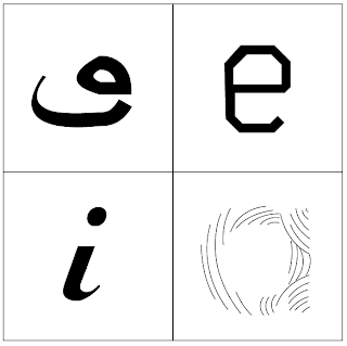
This crit helped me make the decision on which letter to develop into a full alphabet as I was previously unsure. I got good feedback for the soundwave (U) letter as it was a strong visual and arguably the most distinctive out of my designs. I did argue however that it my be overcomplicated and as a full alphabet or word could become illegible. The uppercase E with a section cut out the stem (bottom left below) after explaining that it represented speech disorder, specifically a persons inability to verbally produce the sounds for specific letters was also suggested. I think this letter also has a better concept as I have more thoroughly explored the subject.
I intend to take both the soundwave and speech disorder letterforms a begin creating a few letters for each and have another crit to compare both of them together.
Wednesday, 9 October 2013
OUGD403 Visual Thinking - Alphabet Soup - Studio Brief 1
As the start of our project we were give a word and a font at random which we had to combine to create a sequence/series of ten of our own letterforms using the word and my font 'Futura' as the base of the letters. The word I have been given is 'Speech' and I have to create the letterforms in a 10 x 10 format which relates to or represents this word.
I started to map out anything I could think of relating to the word and how I could incorporate my font (futura).
Futura + Speech - I thought about how the two words would work together in a literal way. Futura made me think of future/futuristic such as binary code, digital, modern language/slang and a more traditional perspective such as scripts, motivational speeches, quotes and different languages.
Alternative words:
Voice
Sound
Mouth
Deaf
Communication
Talking
Singing
Stutter
Language
Type Basics
We started to look at the anatomy of type and how making various adjustments to the letter can change the nature and meaning. For example adding serifs to the typeface could change a non-formal and legible letter or word into a more formal decorated typeface which would communicate something different. Changing individual sections of the type face such as the ascender and x height on the letters can give it different properties.

I have come up with some initial ideas on how I can show elements of speech through my letters, trying to include variation in how I have manipulated the letters by making obvious changes and some more subtle.
Sound waves was one of my first responses and feel it is too obvious. I don't really like how I have represented it either as the lines make the body of the letter too cluttered.
Structure - I chose this as a definition of speech is a combination of vowels and consonants structured by syntax's. The boxes show organisation and a structure to the letter.
I decided to break up the letterform as I imagine stuttering to have similar qualities to this is if was shown physically as it its disrupted speech and can sound quite harsh, hence the sudden cuts and sharp corners.
Looked at ways I could make futura more traditional by adding serifs and experimenting with a script version as I was exploring old play scripts and speeches. Although Im not sure if this is a direction I want to take it as I am more interested in producing a more contemporary typeface for this particular project.

For a lot of my research I was looking at what generated speech and how it was recorded I picked out words which had elements I could display physically in the letter forms each with certain qualities.
Communication/Language
While researching into language and communication I came across the term 'Sprachbund' which is a term used to describe the combination of two languages. Although it only technically happens when two countries speak different languages that are in close proximity to one another, I thought it would be interesting to combine English letters based on the latin alphabet with a completely different language (arabic).
I wanted to show the crossover idea by having a letter from the arabic alphabet merge into an english letter. I have split both of the letters (in this case arabic O and E and english O and E). I tried to not make the letters too abstract and used futura as the base typeface. Using recognisable features of each letter, for example keeping the eye of the E makes the type still legible.
To keep within the brief I started to transform the script arabic writing into a more geometric san-serif typeface like futura. I compared elements of the arabic letterform to the english futura font I was using and made changes accordingly such as keeping the line weight even throughout on the shoulders and tails, removing any serifs and using angles and even measurements.
Above is a project I found on Typothegue by designer Bahman Eslami which relates closely to my project as they have incorporated Naskh, the calligraphic style from which most Arabic/Persian typefaces are derived and adjusted it to work with the font Lava. The arabic letters have been simplified and have taken elements of the Lava font. I hope to take this a step further and merge the word written in both languages on one either by half and half or a more gradual transition.
Here is a concept if I was to extend on the brief. Using the word communicate in Arabic and English and combining the two. This could be used for a language guide for people trying to learn either language in a visual way.
Subscribe to:
Comments (Atom)


